


Designing a Configurable Booking Platform That Scaled from 5 to 20+ Services Without Redesign

Executive Summary
My Role: Lead UX Designer
Team: 2 designers, Product Manager, engineering, QA
Timeline: 8 Months
Scope: Consumer PWA (mobile and web), Business Owner panel, Outlet Manager panel, Super Admin, across 20+ service categories
The brief
The client wanted to build one platform where consumers could discover and book entertainment and personal care services, covering everything from movies and bowling to escape rooms, golf, and salons. The business model depended on being able to onboard new service categories quickly and cheaply, without rebuilding the product each time.
There was no existing platform, no user base, and no UX brief. What existed was a category taxonomy spanning 20+ subcategories across Entertainment and Personal Care sectors, a four-tier user hierarchy the client had outlined, and a backend RFP focused entirely on AWS infrastructure. The client had done market research on the entertainment space, which confirmed the scale of the opportunity but also the complexity: each service category had different booking behaviour, different operational needs, and a different type of operator managing it.
Design scope was mine to define. Early structural decisions would directly affect engineering costs, time to market, and whether the platform could grow without repeated redesign.
Defining the architecture before designing the interface
Before any UI work started, I ran a working session with the PM and client stakeholders to map out role permissions, data visibility, and booking logic across service types. This was not typical for the team at that stage. The instinct was to start designing screens and work out the structure later. I pushed for the opposite, because the risk of getting the structure wrong was much higher than the cost of delaying the UI by a week or two.
That session surfaced the core tension. Movies needed a seat map. Bowling needed lane selection, per-game or hourly pricing, shoe sizing, and guest counts. Events needed date and slot logic. Personal care needed practitioner availability and appointment-level management. Every service type had different booking logic, and the client wanted all of it managed through one platform by Business Owners of varying technical sophistication across multiple outlet locations.
The early direction from the team was to design a separate flow per service type. It felt faster to move forward that way. After mapping out what 20+ separate flows would mean in terms of design, development, QA, and ongoing maintenance, I made the case to stop and change direction.
The trade-off was clear: a configurable system would increase upfront complexity and require closer alignment with engineering, but it would avoid duplicating work across every new service category and reduce long-term maintenance cost significantly. A service-specific approach would be faster to start but would create a product the client could not grow without rebuilding repeatedly. I presented this to the client using their own expansion roadmap to show the cost difference over time. Stakeholders initially preferred separate flows because they were easier to understand. After working through the long-term implications together, we aligned on the configurable approach.
We discarded several weeks of work and restarted.
Early-stage admin flow exploration


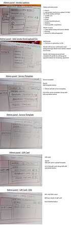
What configurable meant in practice
The booking experience surfaced only the fields relevant to each service type: seat maps for cinema, lane and time selection for bowling, slot calendars for appointments. This was driven by how a Business Owner had configured their service, not by hardcoded interface logic. A new service category could be activated through the Super Admin panel without any frontend changes.
This required the frontend and backend to be designed in parallel. I was in regular conversations with the engineering lead about where configuration logic should live. The key decision was whether the booking form should adapt based on frontend rules or whether the backend should tell the frontend what fields to show. Putting logic in the frontend would mean a code change for every new service type. Putting it in the backend meant the Super Admin could activate a new category without touching the frontend at all. We chose the backend-driven approach. That single decision is what allowed the platform to go from 5 to 20+ service types without a frontend rebuild.
Several decisions that appeared to be UX choices were actually architectural ones, and getting that alignment with engineering early prevented significant rework later in the project.
The role model and permission boundaries
The platform was built around four distinct roles, each with different needs and permission boundaries.
The Super Admin managed the platform: service template creation, business onboarding, commission structures, and offer management across all clients. The Business Owner managed their own business: configuring services, managing outlets, setting pricing rules, and tracking performance across locations. The Outlet Manager had a deliberately limited view, scoped only to the outlets assigned to them, with no access to business-level configuration or finances. The Consumer experienced none of this complexity.
The outlet model was the structural decision that made the Business Owner and Outlet Manager relationship work. A single Business Owner could operate multiple physical locations, each running as a separate outlet with its own Outlet Manager, service configuration, and earnings tracking. The permission logic was designed so that an Outlet Manager could activate services and manage day-to-day bookings, but could not modify outlet structure, assign other managers, or view business-wide financials.
Getting these boundaries right had direct operational consequences. If an Outlet Manager could accidentally change outlet-level settings or reassign staff, that creates real problems at a live venue. The permission model was validated with the client stakeholders through structured walkthroughs of real operational scenarios, not just reviewed as a diagram. That process surfaced two boundary cases we had not initially accounted for, which we resolved before moving to detailed design.
Mapping Platform Scope Before Designing the Interface

Permission Boundaries Across Super Admin, Business Owner and Outlet Manager

Consumer experience
All of the role and configuration complexity had to be invisible to the end user.
The consumer interface was structured around two top-level sectors, Entertainment and Personal Care, with category icons beneath each that updated listings, deals, and venue cards simultaneously. The sector and category navigation model came from the client's requirements. The design work was in how selections cascaded, how the deals surface updated contextually, and how venue cards were formatted to support direct booking without requiring the user to navigate to a separate detail page first.
The original booking path required five or more steps. We reduced this to three by moving contextual decisions (add-ons, food, social sharing) to post-booking moments rather than placing them in the critical path. Features including Uber/Lyft integration and a group booking sharing model were deferred to later phases. These were deliberate scope decisions. The configurable architecture meant they could be added later without structural changes.
Consumer PWA screenshot (web and mobile)

The design system
I built one shared component system covering both the consumer-facing interfaces and the admin panels, rather than 2 separate systems. 2 systems would have doubled maintenance overhead and created inconsistencies over time as they drifted apart.

The meaningful decision was how to handle the visual and behavioural differences between the 2 surfaces. A consumer booking card and a Business Owner dashboard panel serve different purposes and carry different information densities. We handled this through surface-level component variants: customer surface and admin surface variants of shared components, governed by the same token system but with distinct visual treatment. The same spacing, the same button component, and the same input fields underpinned both experiences, while each surface maintained its own appropriate character.
The system included 30+ reusable components and 200+ design variables. It was structured so engineering could extend it for new service categories without requiring design involvement each time. After the project, the component system was reused in adjacent internal tooling and the modular approach became the engineering team's default pattern for new feature development.
Results
The platform launched with 2 enterprise clients. Within the first month, both clients were processing between 500 and 2,000 bookings per month across multiple outlets. This was a greenfield product with no prior user base, so reaching that volume in the first month confirmed that the core booking experience was working and that the Business Owner configuration process was functional enough for real operators to use independently.
The more significant outcome was scalability. The client's team expanded the platform from 5 service types at launch to over 20 without any structural changes to the frontend or booking flows. New categories were configured and activated independently, without requiring design or development work for each one. That was the specific outcome the architecture was designed to enable.
Annotated Business Owner dashboard wireframe

Business Owner dashboard hifi UI

What I would do differently
I would find a way to speak with real Business Owners earlier, even informally. The configuration experience, specifically how a bowling venue operator or salon owner would actually set up their service, was designed largely from stakeholder knowledge and structured assumption mapping. We made reasonable decisions and the system worked at launch. However, some friction in the Business Owner onboarding flow became visible post-launch that earlier operator conversations would likely have caught. The consumer side was well validated through competitive analysis. The operator side was less tested, and that is where I would invest more time upfront in future projects of this type.